
To many of online presenters, it would certainly be a complex debate to justify a title “Mobile Website vs Responsive Theme” – truly, necessitating them to know which would carry actual benefits more than another. With an advent of digital technology, the way of seeing and sharing the information has certainly been fluctuated; more or less with a dense network of digital devices used to display services & products thus far. With varying types of such electronic platforms, the sizes and resolutions would hence differ; wanting one to access details on them much suitably.
Websites that perfectly fit to the resolutions of computers and laptops may require to be obtainable over compact devices another way around (adapting to various sizes they are available in; e.g. smartphones, tablets). Irrespective of the technologies the sites are made within, what way our customers would like to see them is of great values to make it – Appropriate website view along with the clear, smooth and quick-to-navigate texts, pictures and videos is what we greatly require today. Mobile Application Developers (Website Developers) now need to serve a display that is somewhat more device-approachable!
Mobile Design Approach
Mobile Design would mainly work with the elements of Progressive Enhancement (PE), developing a cluster of website designs that are more suitable to users’ real-time needs rather than approaching flexibility of screen size or browser. Adaptive web designs are made with preconfigured CSS and JavaScript (consistent with perceived devices).
“The only website content that is in high demand (used) by the customers will likely consider Mobile Web Theme to approach the most”.
Responsive Theme Approach
Responsive Mobile Themes are developed with a suitable base (along with percentages) that the website designs including CSS3 media queries, media rules and fluid grids are made from. With spotted gadgets (with different layouts & device settings), the features like fluid type, descriptions and videos will be made the most adaptively.
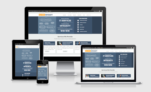
“Responsive Theme, as a whole, is a full website to be displayed on such devices, fitting various screen sizes and relevant resolutions”.
Mobile Website Flipping Over a Responsive Theme Now -
Responsive Theme is the same website (with similar content) being exhibited with same URL on spotted devices. While, Mobile Website will offer only those site content that needs to be open on defined devices, often with different URLs (the content visitors would like to view them the most) – that way mobile websites are much lighter, favorably getting loaded faster than responsive themes and allowing viewers to focus on something that they really need to see.
Unlike responsive theme that would require a whole site to go on various devices, mobile website would be more suitable to eCommerce sites wanting their targets to see only that they wish them to see, eliminating chances of distracting (useless) surfing – an efficient and fast way of online shopping.
Both would weigh in importance of surfing the site in the most adjustable view; relatively necessitating a removal of unnecessary surfing practices – focusing only on viewers’ rich site experience and therefore their pleasing visiting purpose!